

n e c t a r

THE ASK.
For this project, we were tasked with designing a juicer that appeals both in aesthetic and function to a particular target audience. This project was all about product design, as well as brand design, as we developed a branded juicer from start to finish.

target audience.
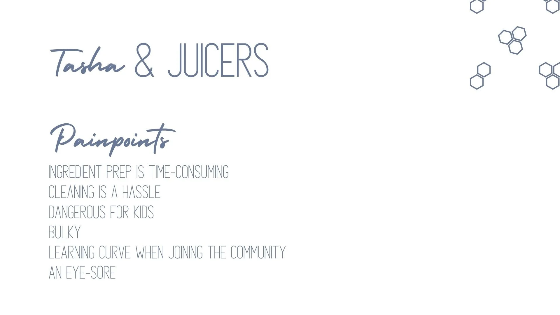
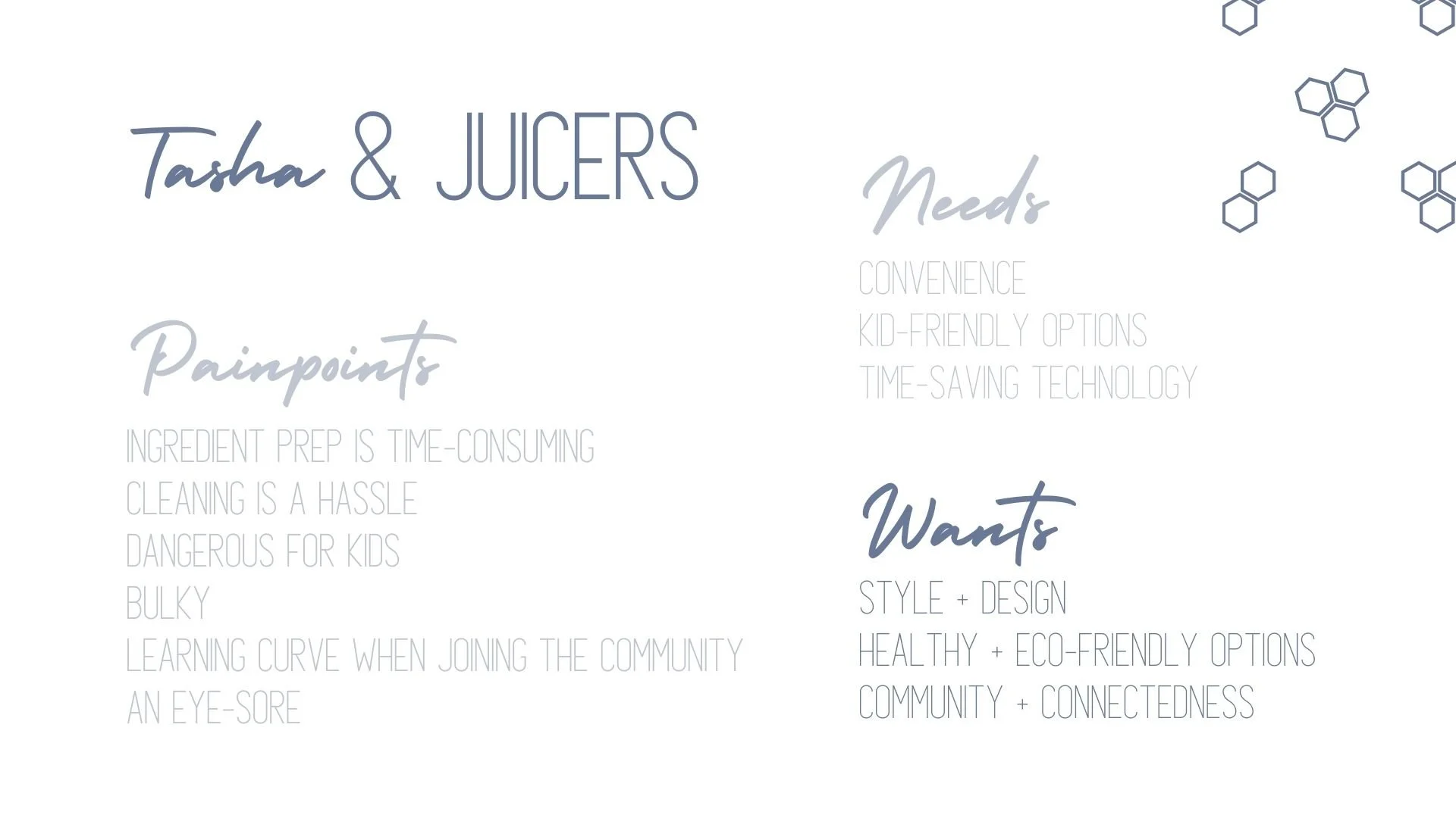
Our target audience was Tasha - a 34-year-old stay-at-home mom of 2 under 6. She is really into all things HGTV, DIY, and trying all the new food trends on YouTube. She never has a free hand, so learning “life-hacks” is her way of life.


the juicer.
After understanding the needs of our target audience, and doing a deep-dive on the function of different juicers, we developed our juicer. A cross between a masticating juicer and a cold-press juicer, ours allows for quiet, efficient, healthy juicing. The masticating portion allows the user to place whole, uncut ingredients into the machine; the cold-press portion helps to maintain all the nutrients throughout the process.

the aesthetic.
Beyond the function, the overall design aesthetic of our product needs to appeal to our target audience. We designed Nectar to be offered in colors that compliment other products that might be in our audience’s kitchen - such as a KitchenAid Stand Mixer. We know that appliances are now being used as a part of the design of a kitchen, so we want Nectar to be able to stay on the counter and add to the overall look. The glass portions of Nectar are made of fluted glass, which is a style that is very on-trend across all household items.


THE brand.
We designed every aspect of the brand to appeal to the aesthetic of our target audience. From the name, to the colors and the font, we designed Nectar to be the ideal juicer choice for busy moms.
-

the name.
Nectar comes from the Greek word nektar, meaning a drink giving longevity and immortality to the gods. Nectar is also defined by the juice extracted from flowers by bees to make honey. We believe this dual meaning really encapsulates the idea behind our juicer and the community our brand intends to build.
-

the logo.
Our logo is meant to reflect a honeycomb. Similar to how bees work harmoniously in a hive, we know that busy moms are working tirelessly to make the world a better place for those around them. We liked the simplicity of the symbol and the impactful meaning it portrays. We also chose to use a san-serif font for our brand because it reflects a more friendly attitude.
-

the packaging.
Like most product packaging, we want Nectar packaging to instantly reflect the aesthetic of the brand while showing the contents inside. Our brand’s signature blue color represents tranquility and credibility. The minimalistic packaging sticks to our brand’s overall personality.

the app.
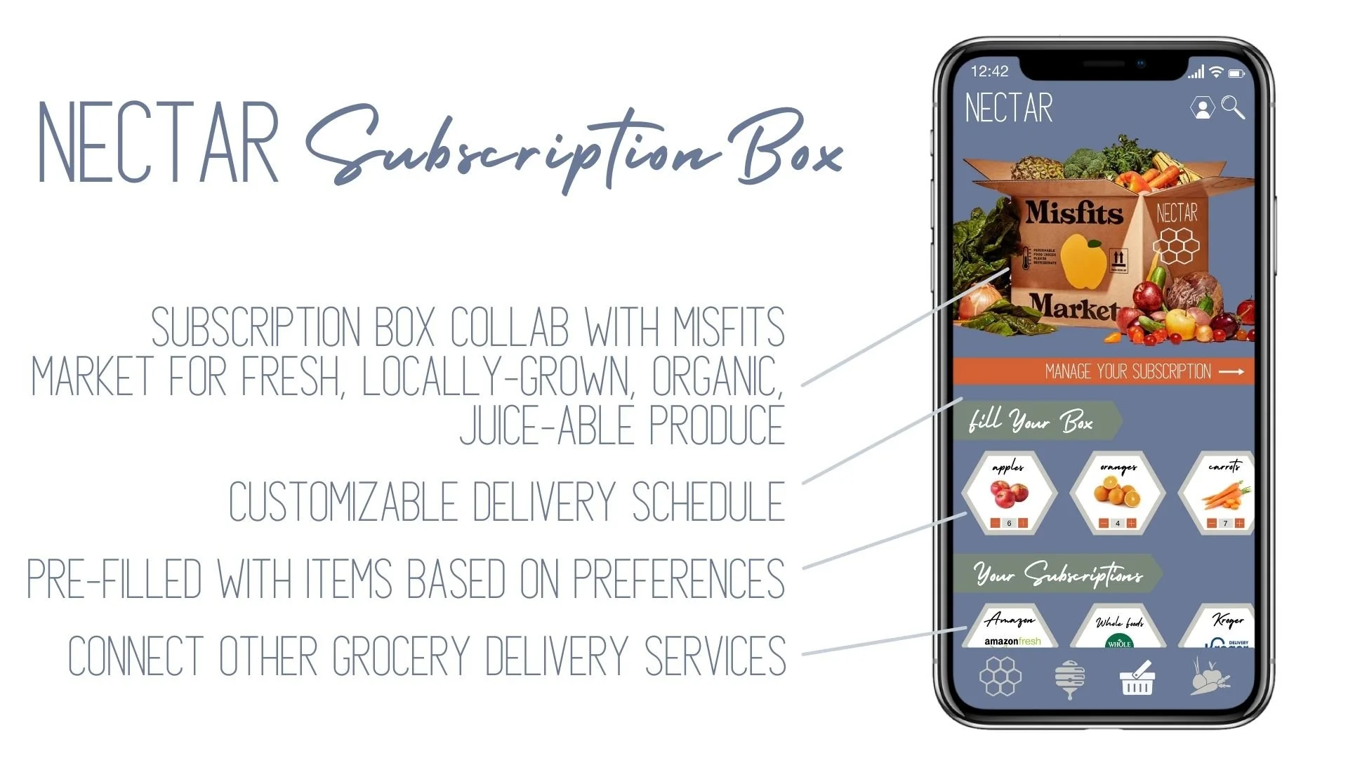
We understand that our target audience desires community, convenience, and ease-of-use in their appliances. Inspired by other smart appliances, we developed an app for Nectar that offers device controls, integration with smart home devices, and access to delivery subscription services. Additionally, the app builds community through its Hive social media platform, and encourages experimentation through its tailored recipe recommendations.


-
THE TEAM.
Allia McDowell (CBM ‘23)
Arianna Gordon (CBM ‘23)
Justin Zollar (CBM ‘23)
-
MY CONTRIBUTION.
I dug deep into the habits, preferences, and lifestyle of our target audience. I developed the original sketches for our functional design, as well as researched the functionality of juicers. I also developed the app and created the app mockups. I played an integral role in designing the brand identity, and executing on how to carry the identity through each aspect of the launch. I also wrote the overall deck storyline and brand tagline.
EXPLORE OTHER PROJECTS.